BrainStation Student Portal
Redesigning the student portal through a design sprint

The Project
BrainStation is a training organization providing courses on digital subjects such as UX Design, Web Development or Product Management.
The project was to imagine a new student portal through a design sprint.
My Role
In a team of 4 designers, I was in charge of the dashboard interface.
Tools
Sketch for wireframing
UX Challenge
The challenge was to conduct a design sprint in 4 days, each days dedicated to a specific task:
Day 1: Research and ideation
Day 2: Sketching
Day 3: Prototyping
Day 4: User testing
Research and Ideation
We started with evaluating the portal’s strengths and weaknesses.

The portal's strengths were:
It was intuitive, therefore easy to use and find information needed
All the course materials were available
The daily agenda was appreciated
Its weaknesses were:
The dropdown menu made it tedious to access a specific material
To see the events, the students had to exit the portal and go back to the main website
The student couldn't track their progress in the program or the challenges
A resources section and a contact section were needed
The students didn't know what the hamburger icon was for
Assessing the portal enabled us to make assumptions on opportunity areas:
View upcoming events from the portal
Track courses and challenges progress
Submit work and receive feedback
Access to resources instead of using an external tool (currently using Slack)
Contact staff and other students
Next, we interviewed student to understand their needs and verify our assumptions. From the interviews, we created a user journey map to identify students pain points and confront them to our opportunity area assumptions.
Our assumptions being confirmed, we developed “How might we” questions to capture all the possible opportunities and prioritized them. Due to our 4 days time constraints, we decided to focus on:
Creating an easy and pleasant portal experience
Tracking courses and challenges progress
Implementing a resources section
Keeping the students updated on events and announcements
User journey with HMW questions
Sketching
We started with online research for portal interface interactions then proceed to a sketching activity and a silent doting vote to determine the direction we would take for the redesign.
Finally, we created a storyboard using the voted sketches to visualize students journey using the new portal. Our portal redesigned included a new dashboard, a new course material section, a resources section and a challenges section.
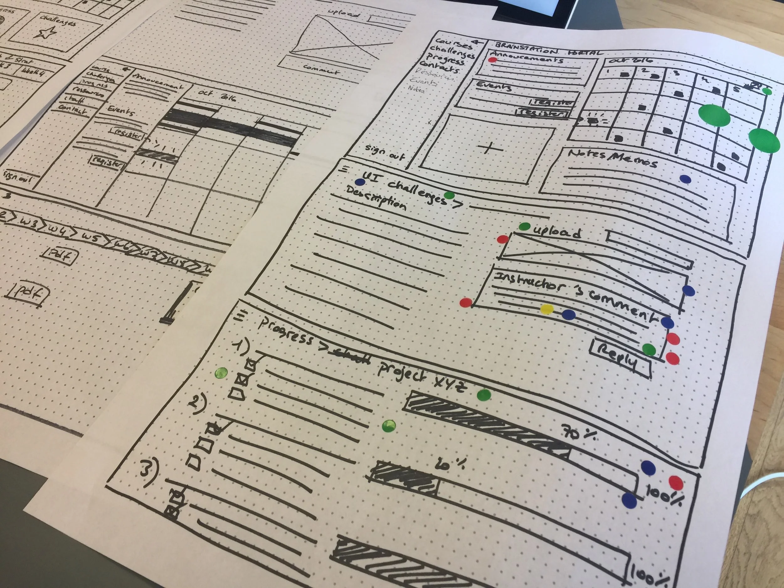
wireframes


Storyboard
Prototyping
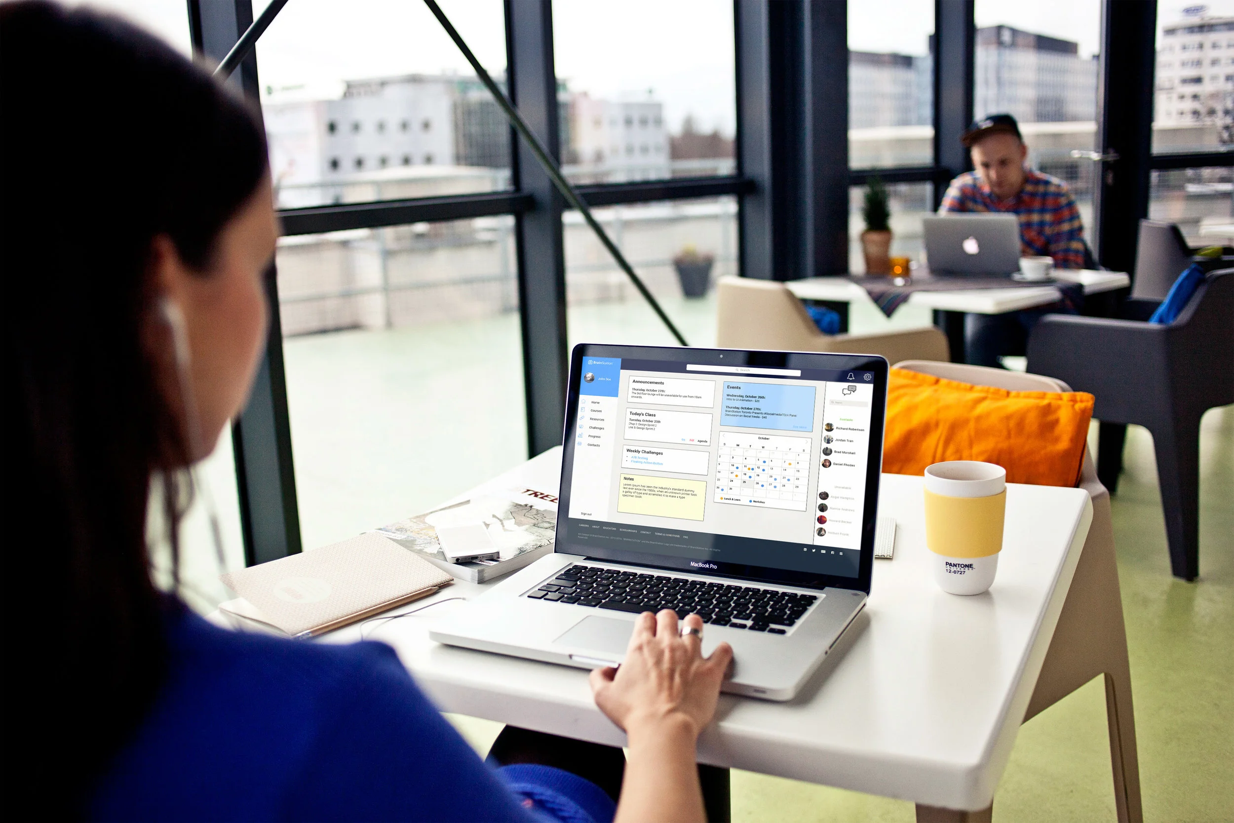
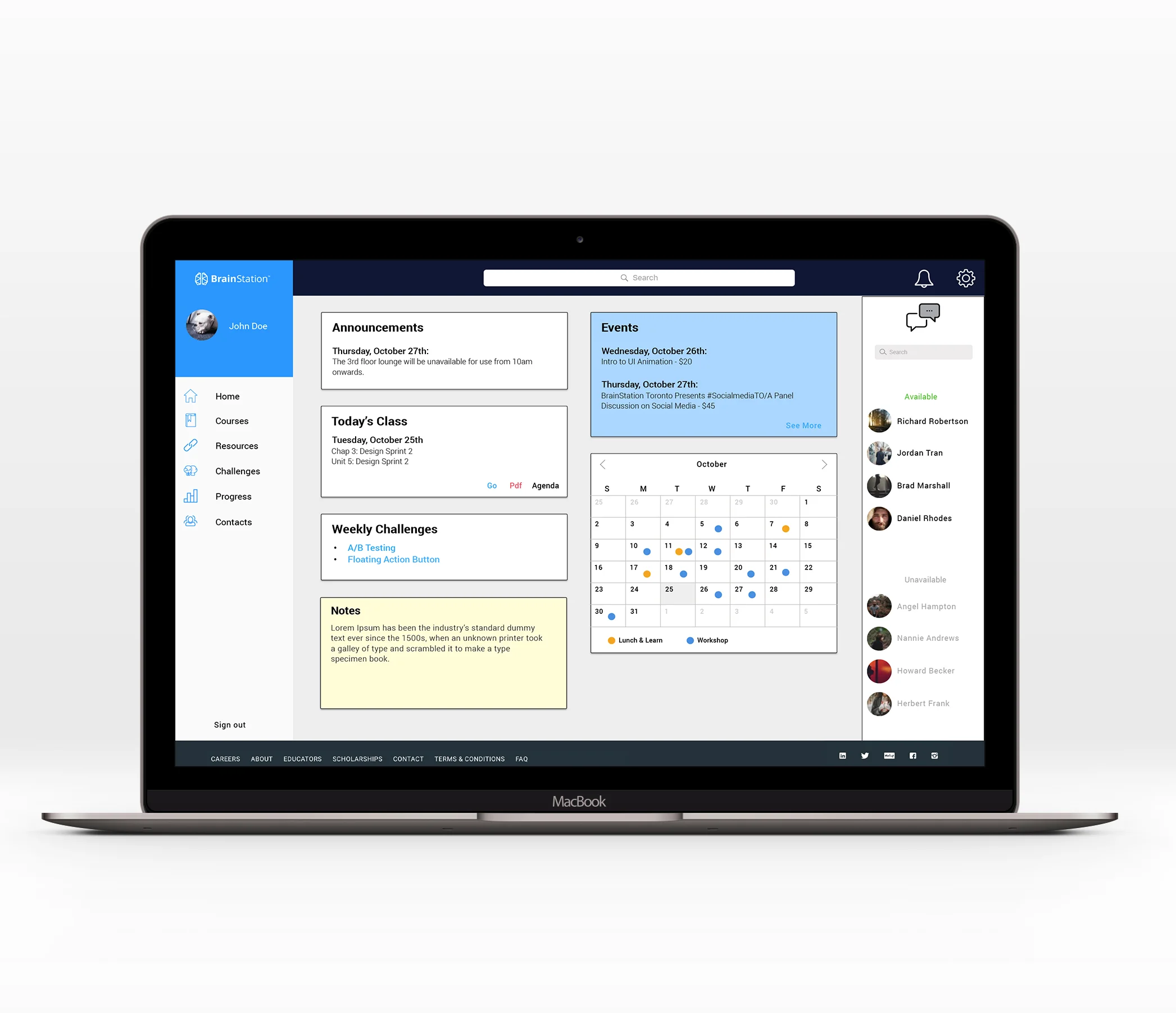
We divided the work and each of us worked on a specific feature. Since the dashboard I sketched received the most votes, I decided to take on that part.
For design consistency, we began with developing a wireframe template before each working on our own part. The template included the top and vertical navigation bar based on the BrainStation style guide.

redesigned dashboard

redesigned course materials

Resource section

Challenge section
User Testing
The focus of the last day was to assemble all of our work together and test it out on five students to identify usability issues. We uncovered:
For the dashboard:
Despite relevant information, the cards were too big
The calendar was missing the legend, therefore students couldn’t identify the different events
The chat opening at the bottom of the page forced students to stop what they were doing to scroll down
For the course material sections:
Students liked being able to easily see weekly topic with the progress bar at the top of the screen
Students liked being able to take notes but the note section was preferred near the lesson rather below, allowing them to view everything at once
Students liked seeing the agenda next to the course content
For the progress section:
Students liked seeing all the challenges and keeping track of what they submitted
Students liked comparing themselves to others with the leaderboard
The names of the different challenges were missing
For the resource section:
Students liked being able to have all the resources in one place
Students were confused by the preview of categories
The 'Contribute' card was too big in comparison of the other cards
Iterating
The challenge ended after the testing but I took on my own to improve my part based on the testing results. I changed the chat box layout and reduced its size; similarly, I reduced the cards sizes and added the most used sections. Finally redesigned the calendar and added a legend.
Lessons learned
What I learned from this project is that good team work requires to be open minded, to listen to the teammates ideas and chose designs based on the project's best interest instead of one designer's personal ego. Moreover, its important to express ones views and ensure that everyone is heard so it can be discussed.