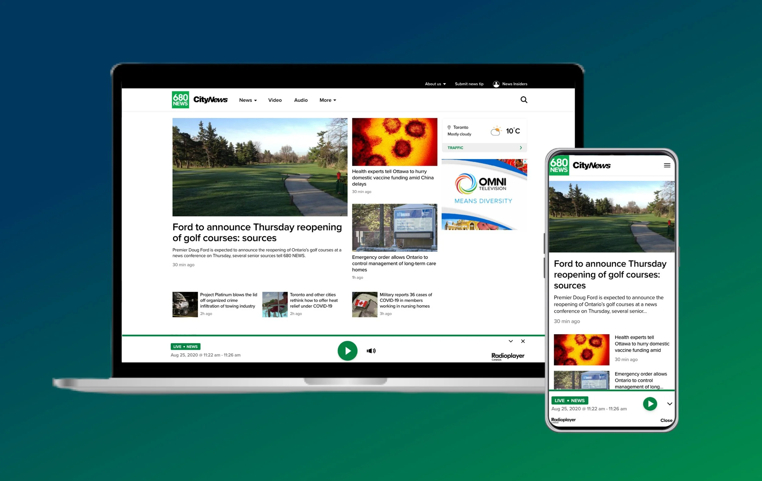
CityNews website redesign
Combining two websites into one
Project Goal
Rogers Communications is the largest Canadian telecom and media company operating in the field of wireless communications, cable television and mass media. Rogers owns a media division with TV channels and radio stations, which included CityNews Toronto, a TV News program, and 680 News, a radio station for Toronto. Both outlets had local versions in major Canadian cities.
Since CityNews Toronto and 680 News websites looked very similar and were managed by the same editorial and digital teams, the News leadership decided to merge them into one website. All the local properties would follow the same treatment, each local CityNews website would merge with its local radio website.
Role
I worked on this project as a Senior Product Designer and led the redesign strategy, created the website information architecture and designed the new website interface.
Design Process
Design strategy
Through data analysis and internal secondary research on our media outlets, I discovered that:
Our traffic came mostly from mobile, with approx. 70% of mobile visits through Search and Social.
The three most entered pages were the article page, the video pages and the homepage.
The most entered pages had the highest bounce rate.
I concluded that most users came to our websites to consume the story they were interested in and then move on.
Through the redesigned website, the leadership expected to see an increase in sales revenue. Sales were driven by ads and dependent on Unique Visitors views. Consequently, my objective was to increase our Unique Views by helping users find and access more content on our website.
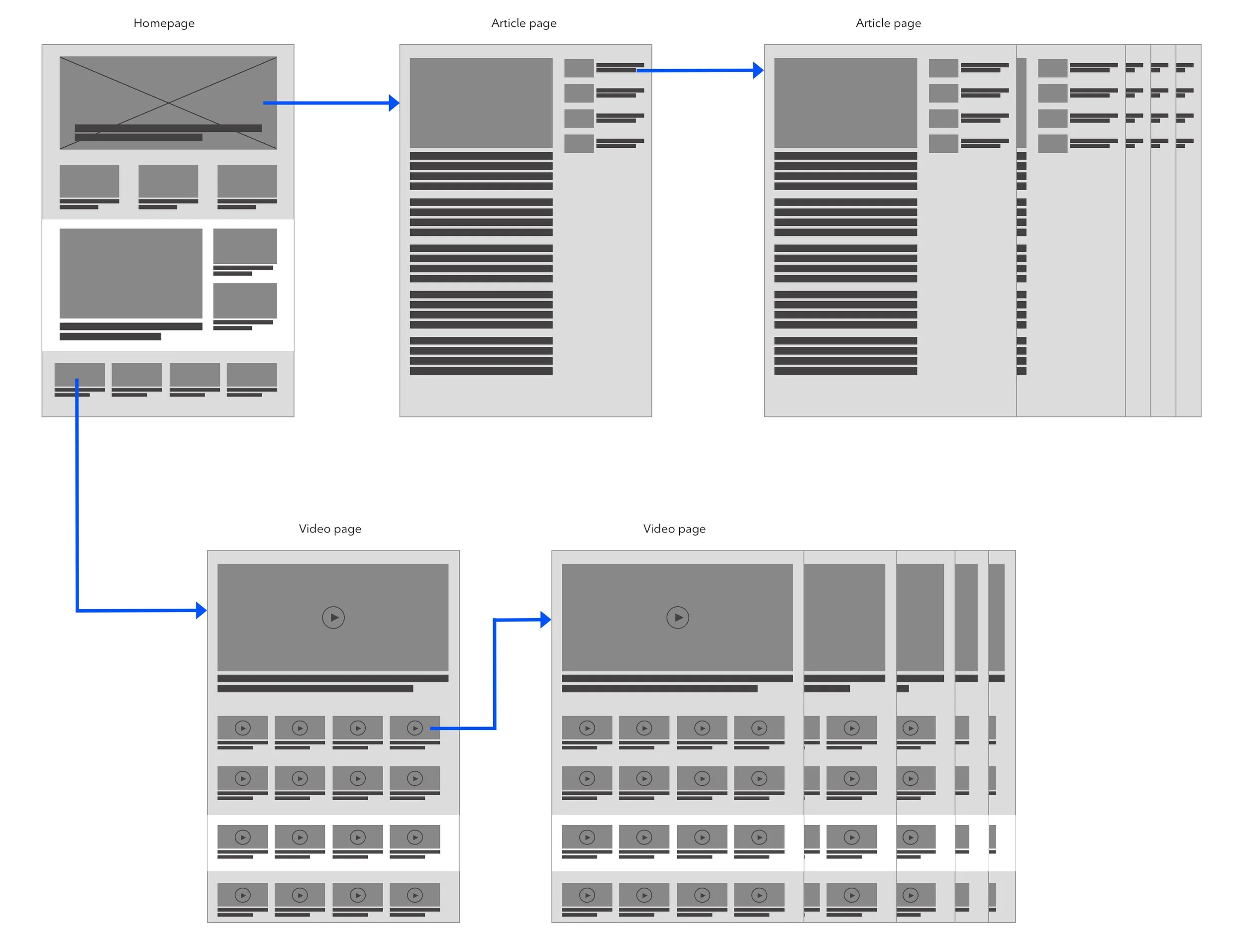
Based on our users’ behavioural archetypes, I created a user journey with the three most entered pages.
user journey
Combining two websites meant finding the best way to combine their brand identities. Since I didn’t have a say in branding or content, the best way to approach the project was to provide tools for the editorial team to do so.
I established that I needed to design template pages for the editors to use. The pages would be made of modules, some modules would be content specific while others would be content agnostic and reusable. This solution would allow editors to choose the most suitable modules for their content while maintaining design consistency on the website.
Homepage redesign
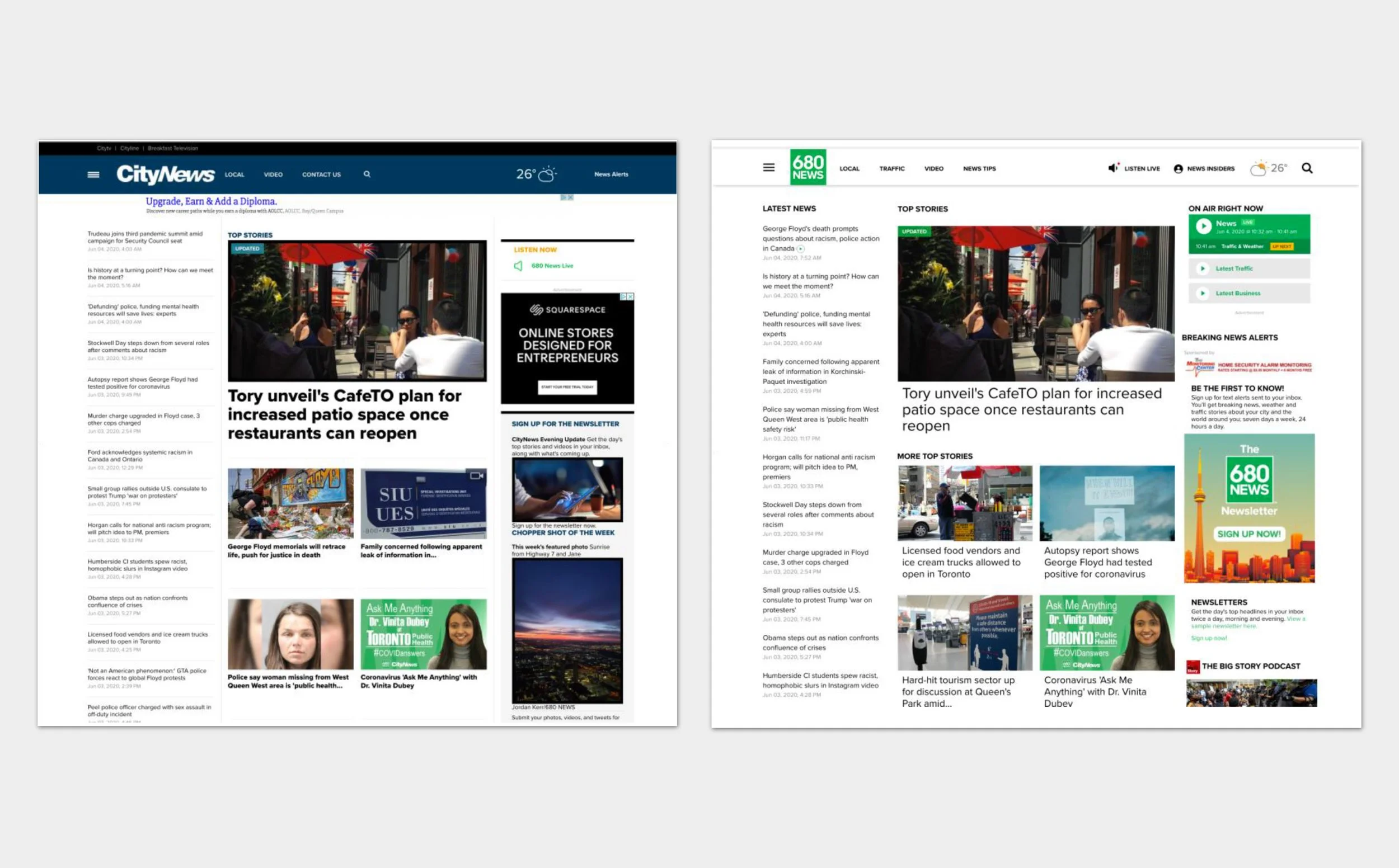
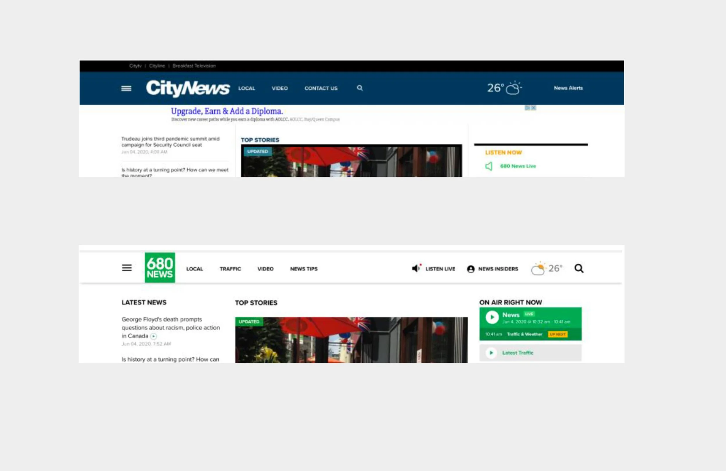
EXISTING HOMEPAGE OF CITYNEWS toronto AND 680News
Improvement opportunity:
Despite the visual hierarchy, the interface could look more enticing through more imagery and different content sections.
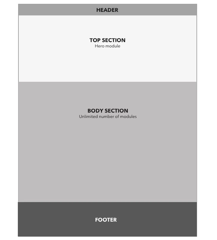
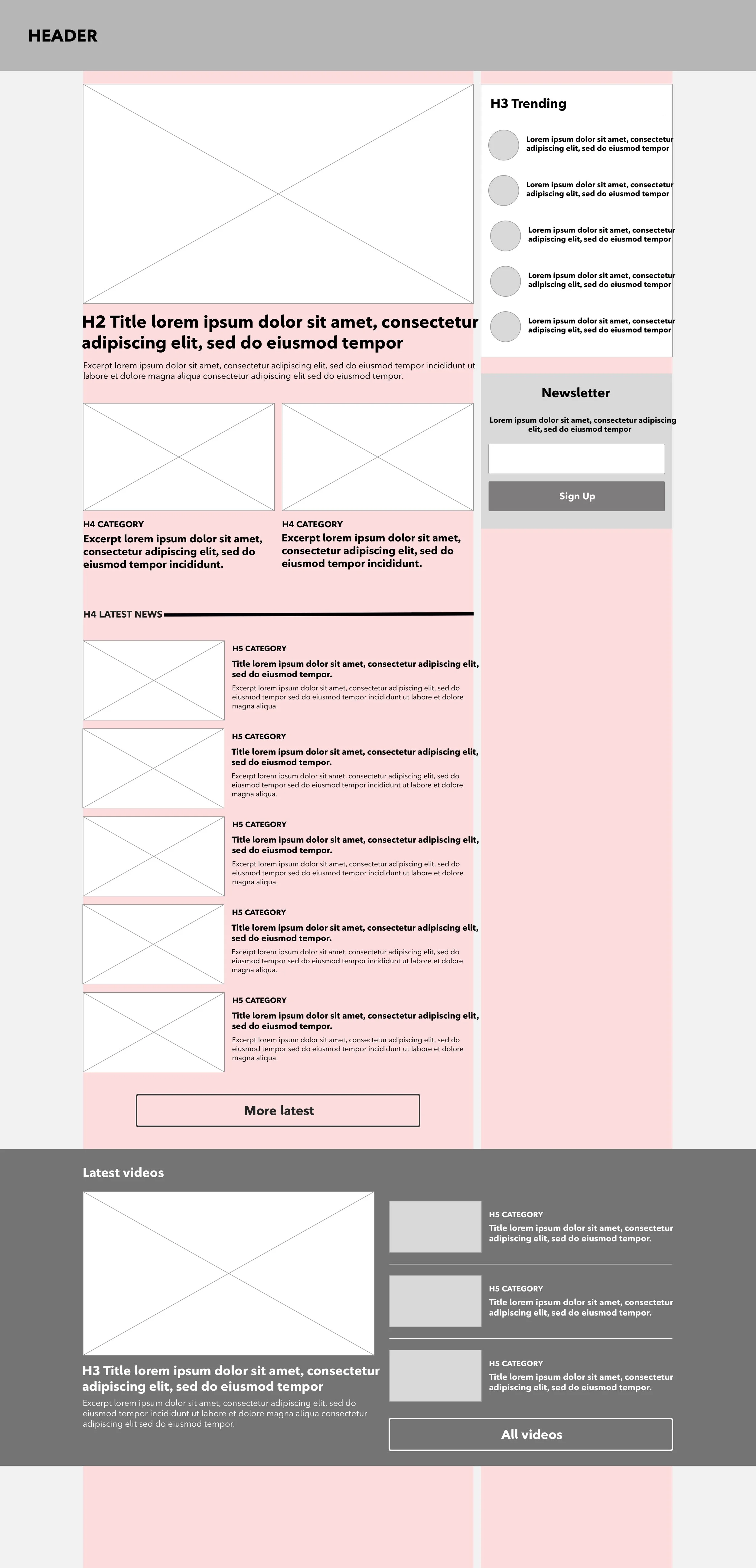
On desktop, I envisionned the homepage to be made of two sections. The first section would contain a hero module, a specific module for the homepage above the fold for the main headlines, and the second section would contain content agnostic modules editors would place based on topics to publish.
Homepage sections
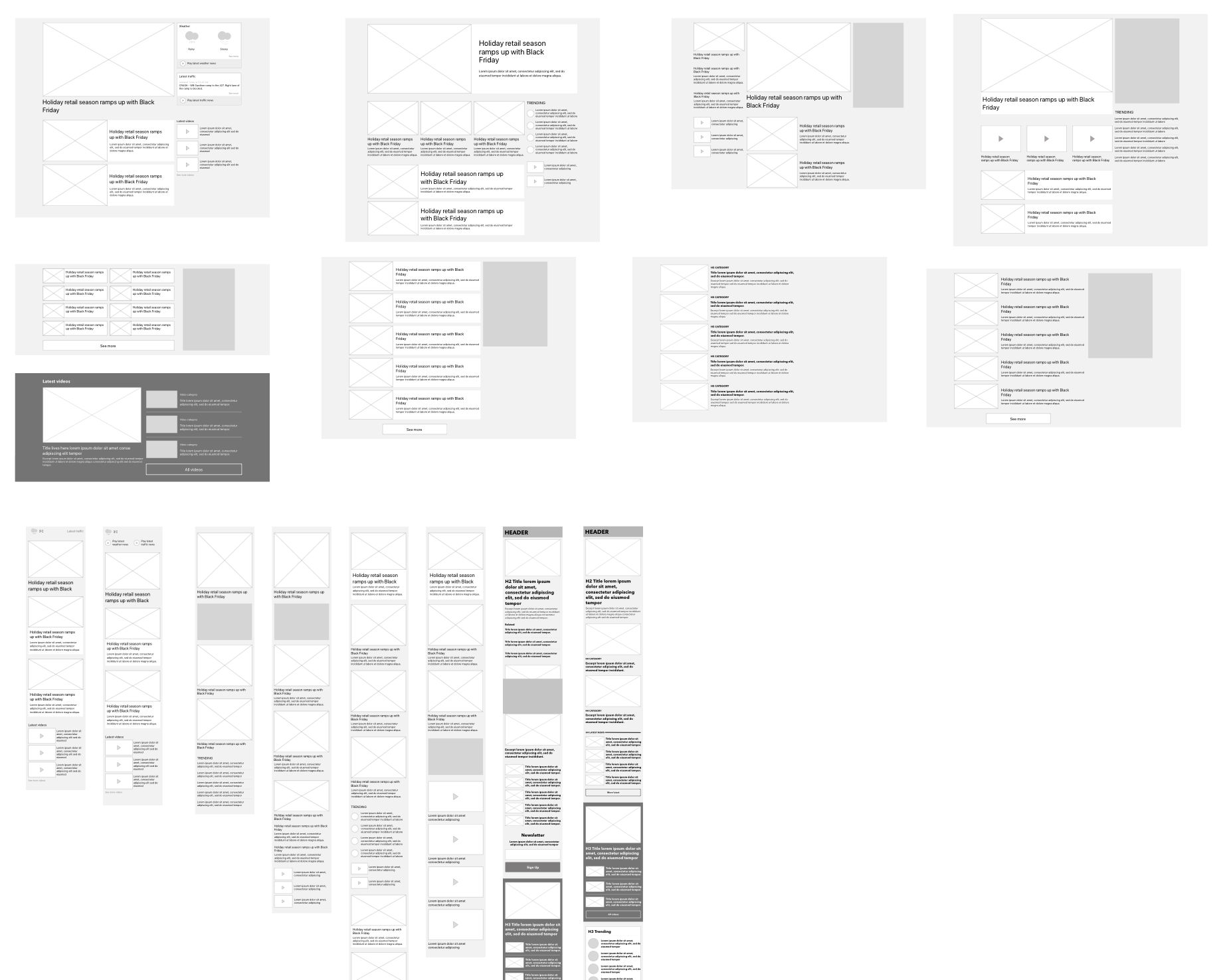
homepage modules exploration
modules exploration
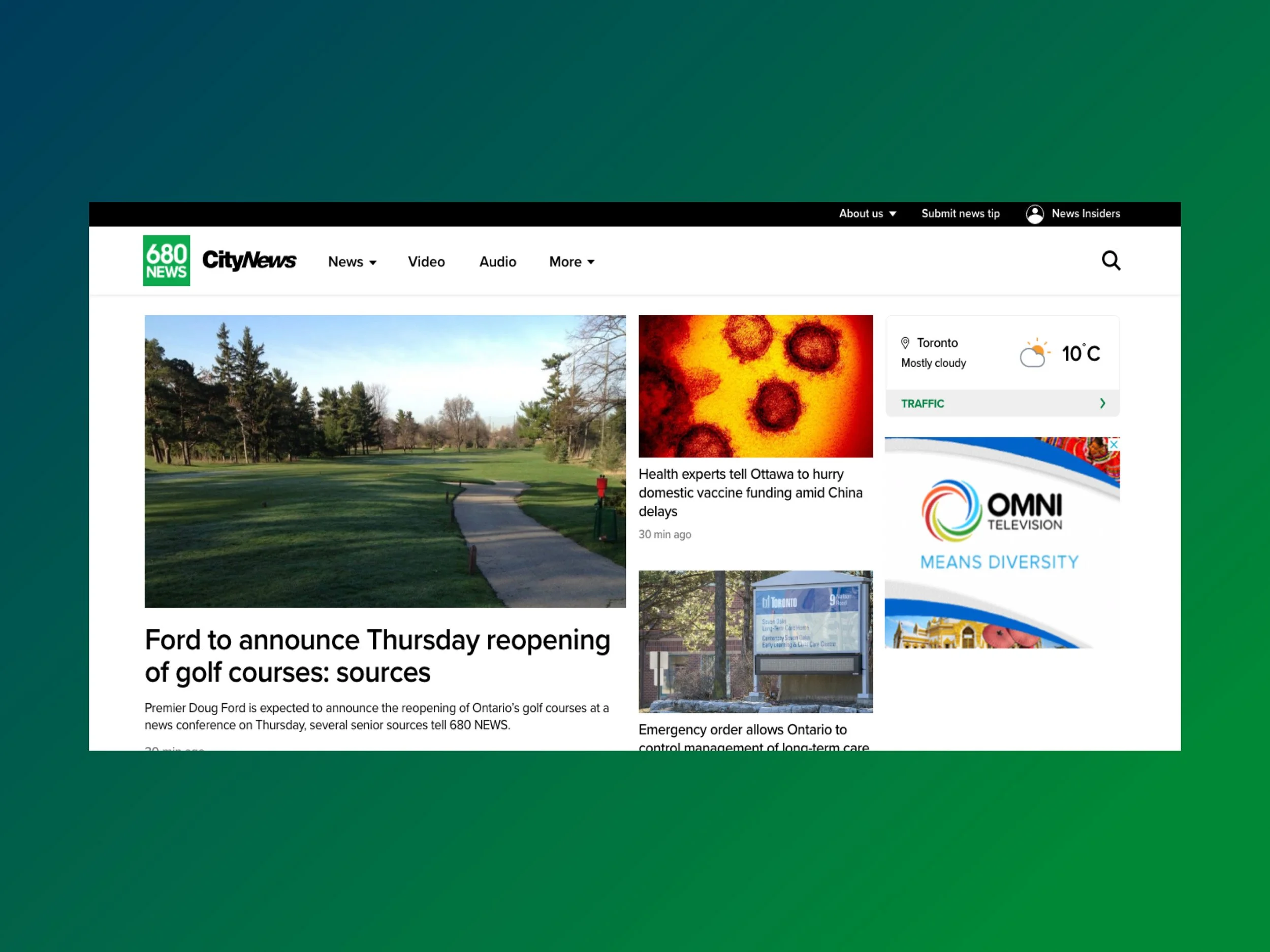
redesigned desktop hero module
Hero Module
On desktop, I created a hierarchy with different card sizing for users to easily identify the main headlines and scan through them.
I also placed weather and traffic in the hero module as they were key elements of the radio brand.
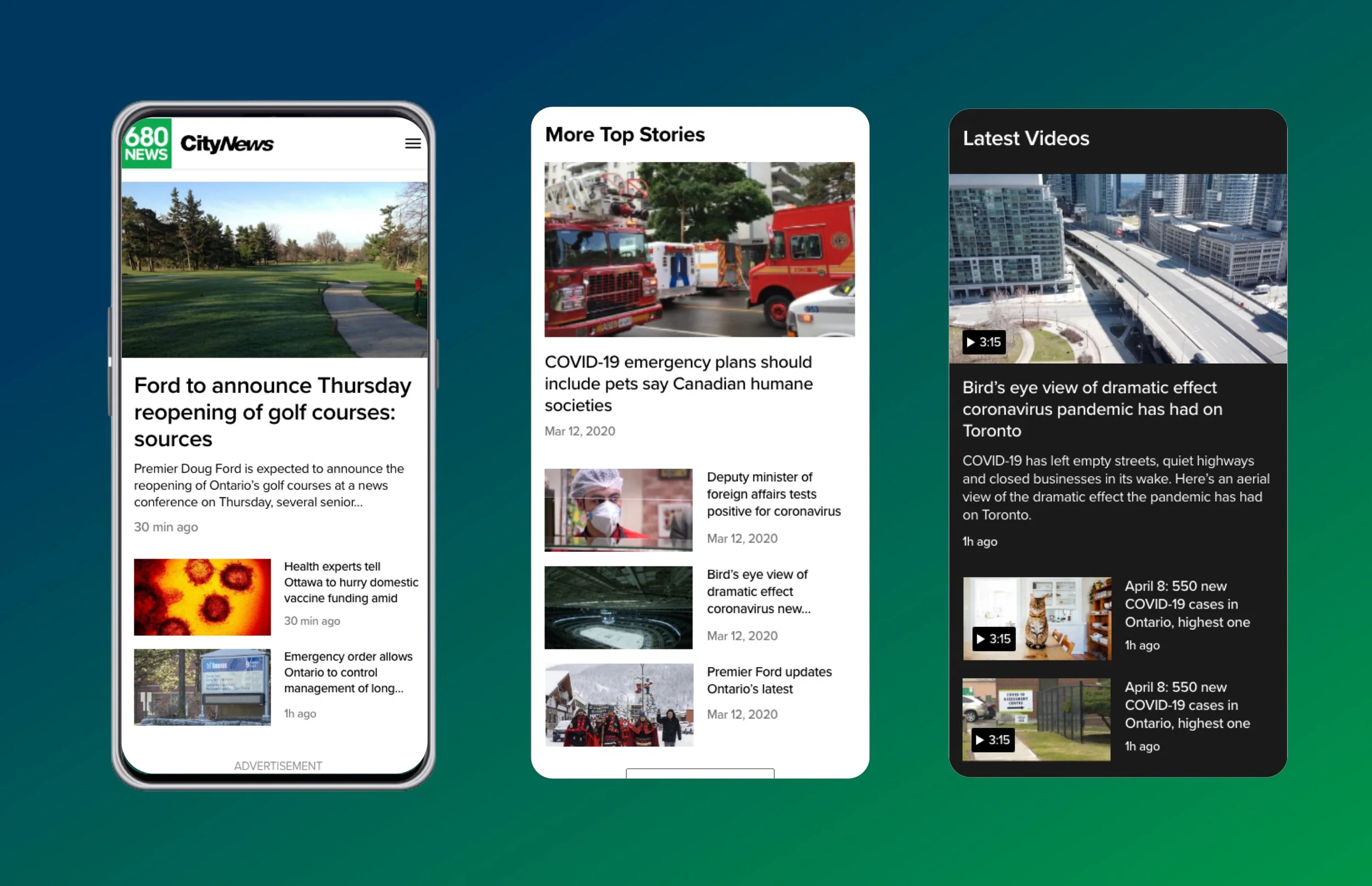
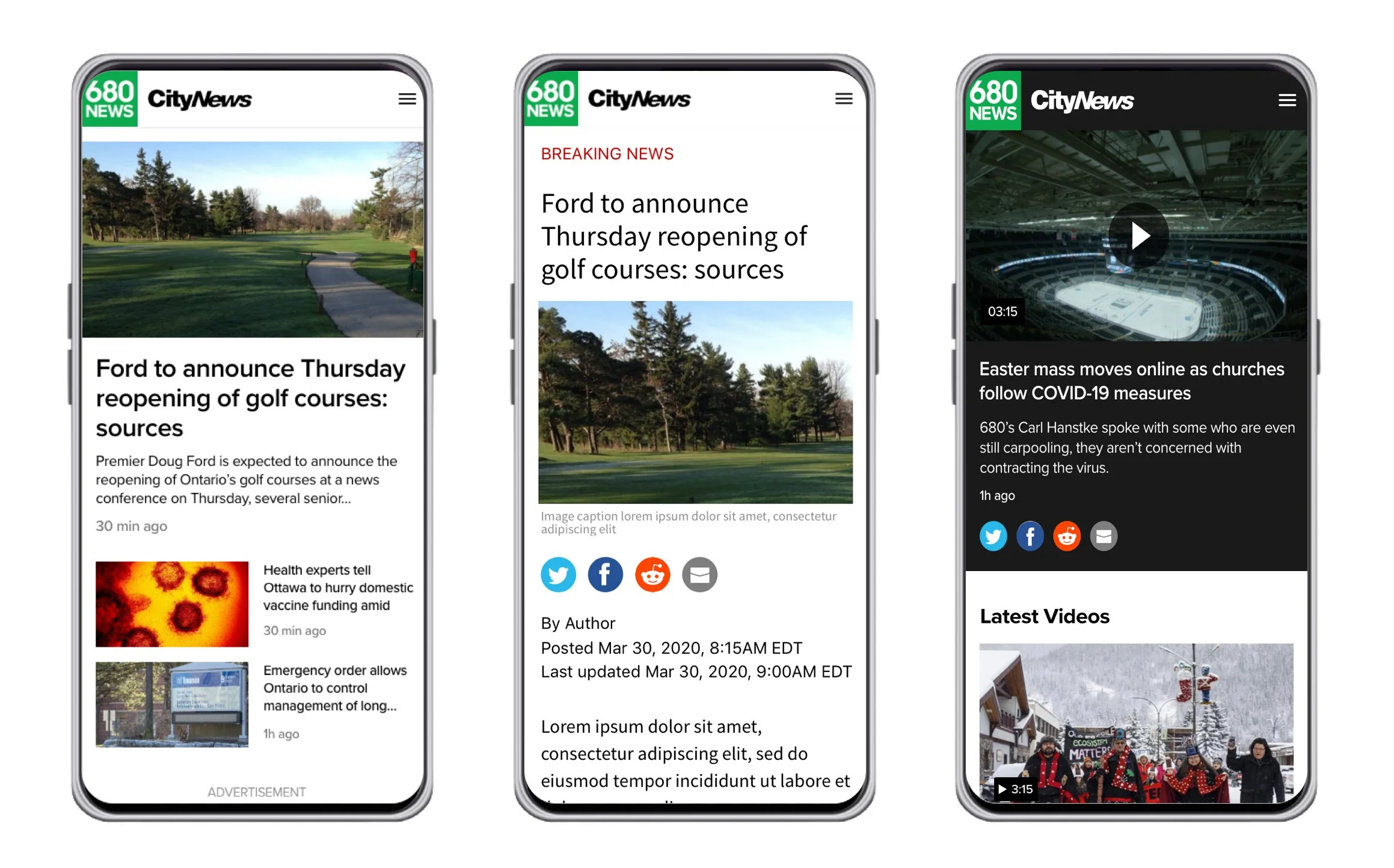
redesigned mobile homepage
Mobile optimization
I created a pattern with the modules where each module started with a full width media component, followed by 50/50 components.
This design allowed for quick scanning and clear separation of content.
Article page redesign
existing 680news article page
Improvement opportunity:
The existing article page presented five articles back to back accessible through a long scroll. The only way for users to choose their next article was to select it from the homepage or the nav.
There was an opportunity to allow users to go from story to story directly from this page.
Intentional reading experience
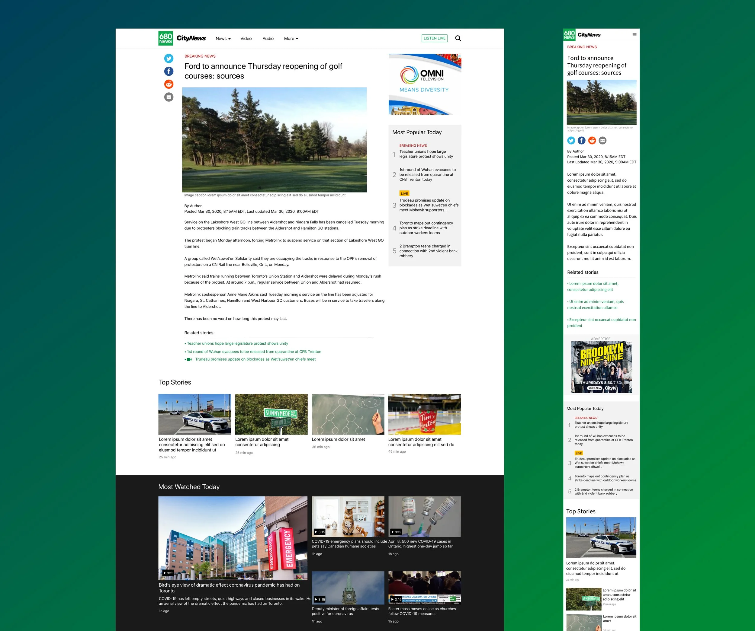
I removed the long scroll so that users could focus on the article they were interested in, then choose what to read next from the recirculation modules on the page.
The recirculation modules were made from content agnostic modules reusable throughout the website.
Video page redesign
Improvement opportunity:
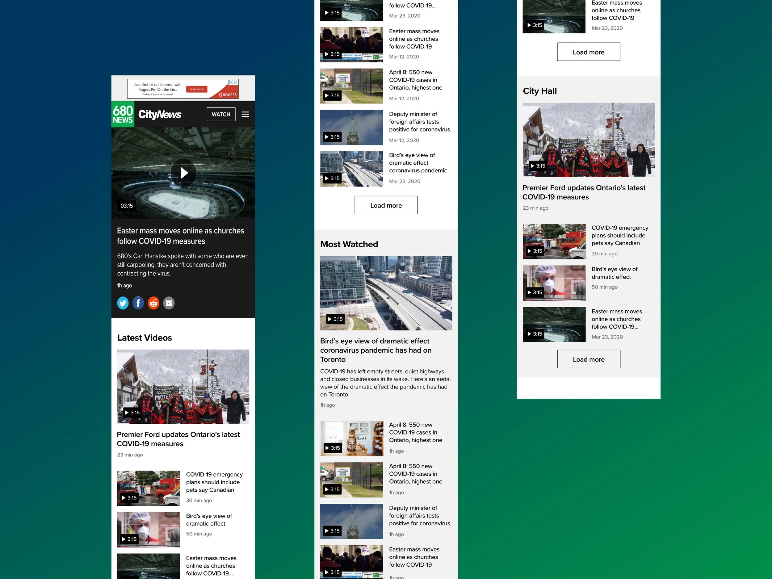
The existing video page wasn’t designed for mobile. Users had to scan through all the Live video placeholders before reaching videos they could play.
Moreover, the media component was full width, users could spend a long time scrolling before finding something of interest.
There was an opportunity to allow users to quickly find a video to watch.
Quick access to videos
I reused the module pattern introduced on the homepage to allow users to easily identify and go to playlists.
Top nav redesign
Improvement opportunity:
The nav was split into a primary nav, leading to main content such as local news or videos, and a secondary nav, which was a list of pages hidden inside a hamburger menu.
There was an opportunity to revisit the information architecture through category grouping.
Focus on main content offerings
CityNews mainly focused on written articles and video content while 680News mainly focused on written articles and radio live streams.
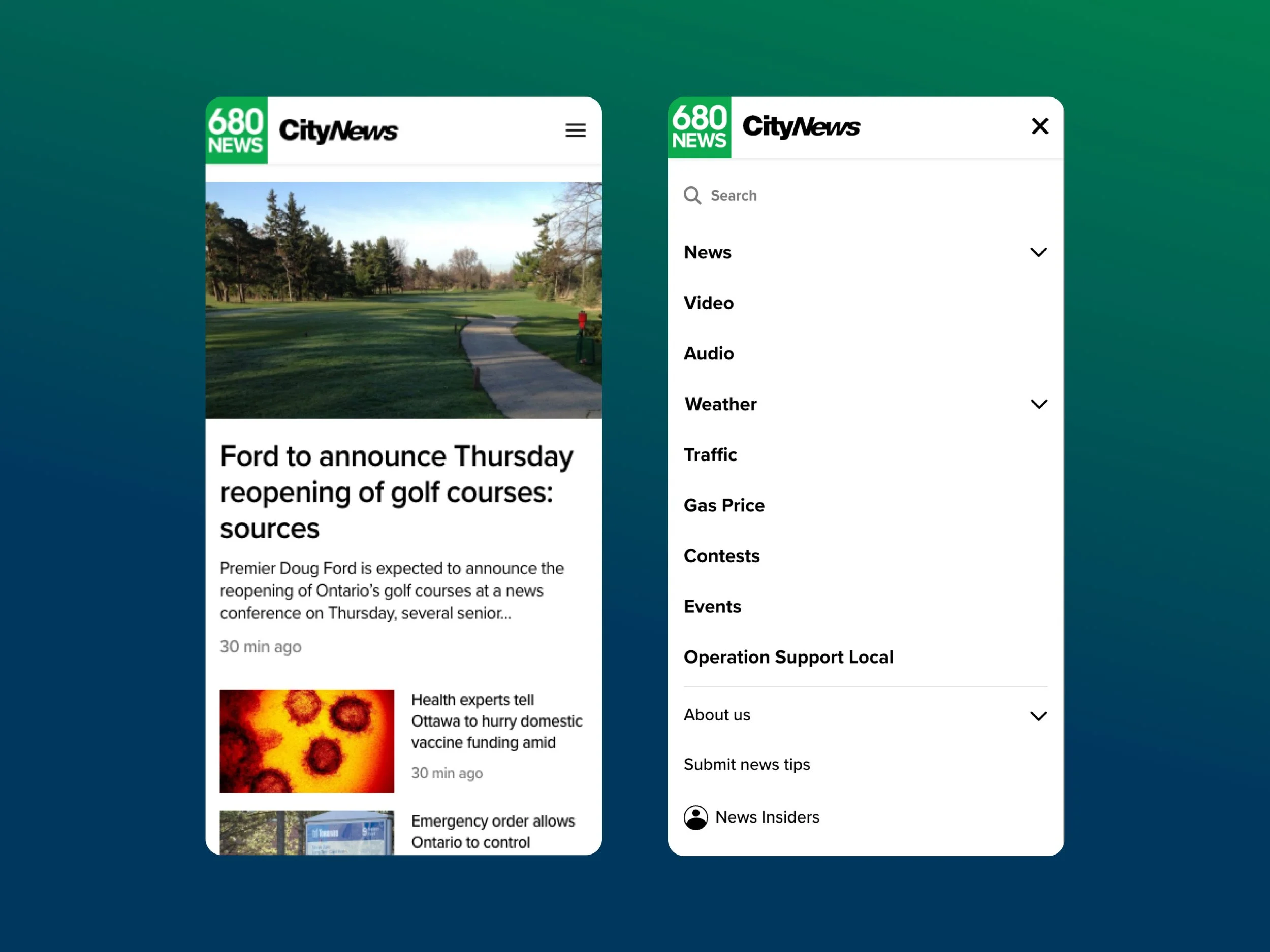
I designed the new nav to emphasize on content type. Specifically, on desktop, the primary nav provides direct access to reading, watching or listening while the secondary nav links to company related information.
Effective navigation
Following the new primary and secondary goals, I created a visual hierarchy between pages through font weight and size on mobile.
The pages related to content were at the top with heavy and big font while pages related to company information were in thinner and smaller fonts.
Results
Once I redesigned all the website pages, I handed off all the designs for users testing. The test was a success without any major usability issues and the redesigned website launched after a few months.
If I were to follow up on the project post-launch, I would have monitored unique views and bounce rates to assess the success of my solution.
