Case study: CityNews website redesign
Combining two websites into one
Company
Rogers is the largest Canadian telecom and media company operating in the field of wireless communications, cable television and mass media.
Role
I worked on the project for one year as a Senior Product Designer. I led the redesign strategy, created the website information architecture and designed the new website interface.
Project Goal
Rogers owns a media division with TV channels and radio stations, which included CityNews Toronto, a TV News program, and 680 News, a radio stations for Toronto. Both outlets had local versions in major Canadian cities.
Since CityNews Toronto and 680 News websites looked very similar and were managed by the same editorial and digital teams the News leadership decided to merge them into one website. All the local properties would follow the same treatment, each local CityNews website would merge with its local radio website.
Discovery
I started the project with a 3 week research phase to understand the digital News industry, familiarize myself with our websites and identify user needs.
Through data analysis and internal secondary research on our media outlets, I discovered that:
Our traffic came mostly from mobile, with approx. 70% of mobile visits through Search and Social.
The three most entered pages were the article page, the video pages and the homepage.
The most entered pages had the highest bounce rate.
Due to the nature of the content we offered, I concluded that users would come to our websites to consume one story they were interested in and then move on.
Understanding stakeholders expectations
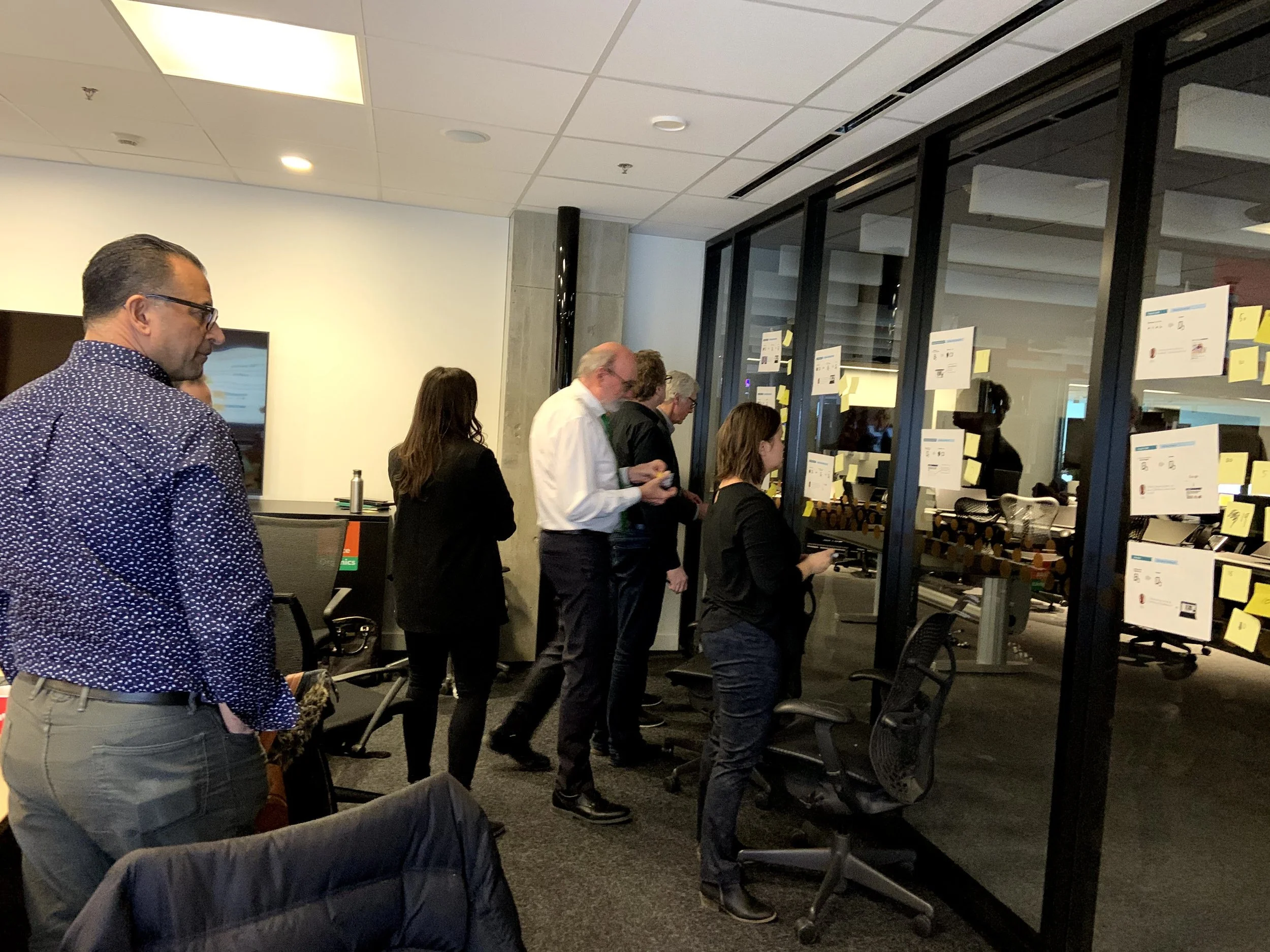
I organized a design thinking workshop with my key stakeholders to understand their design expectations.
The stakeholders on CityNews wanted an emphasis on video and investigative content, while those on the Green Radios wanted a focus on live radio and short sizeable News.
In a nutshell, they both wanted to reflect the identity of their own outlet on the new website.
Design strategy
Defining UX goals
The executive team aimed for an increase in the sales revenue with the launch of the new website. Sales were driven by ads and dependant on Unique Visitors views, thus my responsibility to increase our Unique Views.
From a user journey perspective, I wanted users to stay on the website as long as possible by continuously discovering new content in order to increase Unique Views and consequently ads impressions.
For the interface, I envisioned creating a set of modules that could be used throughout the website to maintain design consistency.
Establishing design vision
Through internal secondary research, I identified two types of user behavioural archetypes that helped me uncover user needs and define user journeys for the website.
The loyal reader
They appreciate the brand and dedicate some time to visit our websites for their daily news. They enter the websites through the homepage to navigate through content.
Main opportunity area: Design the homepage to offer a better access to content and easier navigation to users preferred pages.

The social reader
He is driven to a specific piece of content on our website through organic search and social. He leaves us as soon as he is done to continue browsing online.
Main opportunity area: Create interest to continue browsing with us through the most entered pages; the article and video pages.
User journey
Based on the behavioural archetypes and the increase of unique views objective, I sketched a high level flow of the user journey I wanted to create with the three most entered pages.
user journey
The homepage would be organized by different type of content for users to easily identify and access.
The article page would link to other main stories through a recirculation module, so that users could go from stories to stories without having to go to the homepage.
The video page would show different video playlists below the video player for users to easily find the next video to play.
Exploration
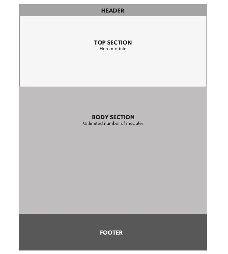
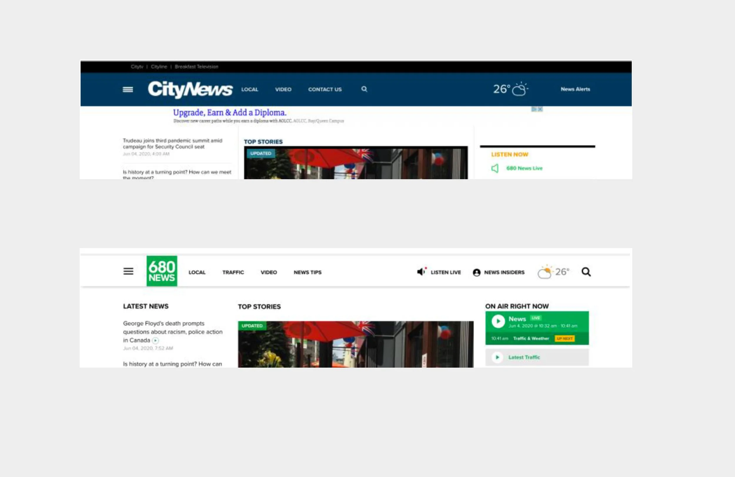
The Homepage

existing homepage of citynews and green radio websites
Improvement opportunity
The current websites homepage showed a visual hierarchy though the interface could look more inviting to users with more imagery and a better display of content.
I established that the homepage should be built with different sections to make it easier for the editorial team to work with. The page would consist of different modules the editors could select then drag and drop in the desired sections.
I started to explore the design of the interface by mocking the page with different kind of modules to have an overview of what the page could look like and the kind of modules needed. Then I spent more time designing the Hero module.
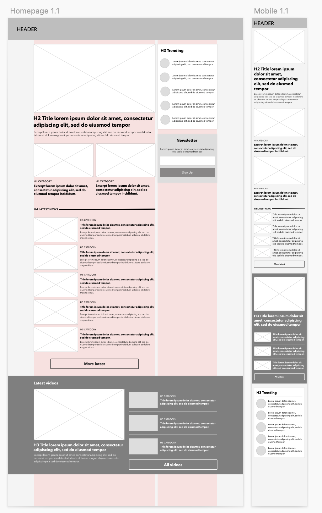
homepage exploration wireframe
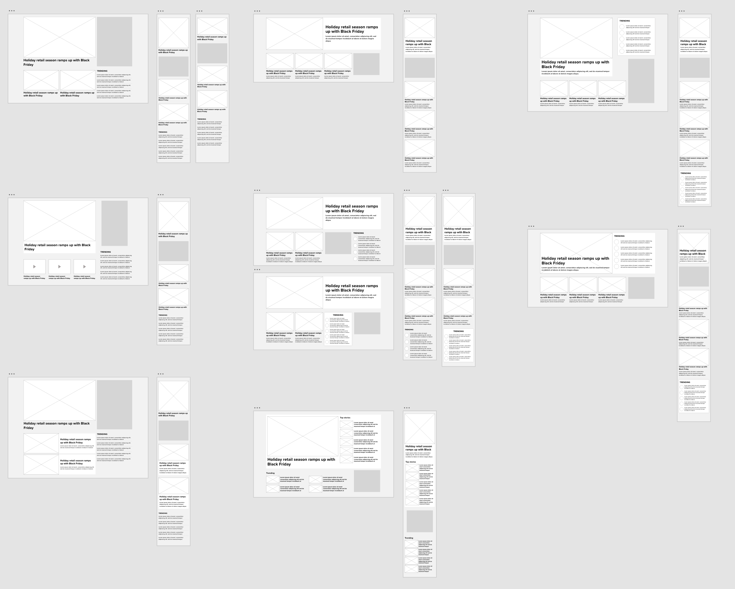
hero module exploration wireframes
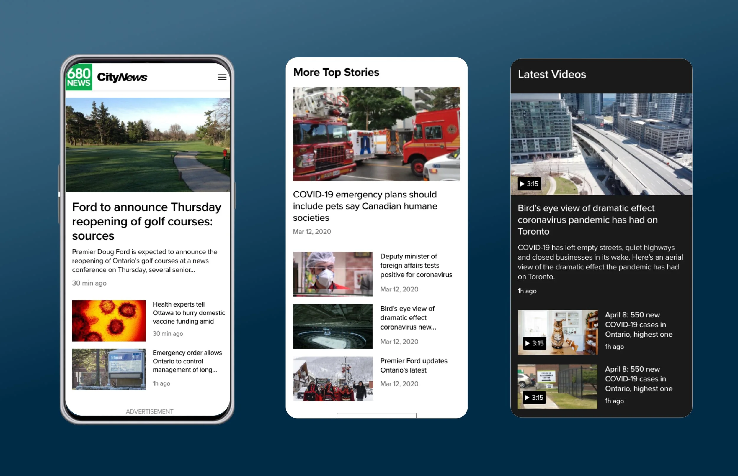
redesigned mobile homepage
Mobile first
Since most of our traffic came from mobile, it was important that the new design was mobile friendly.
For mobile, I created a pattern with the modules. Each module started with a full width media component for the first story then it was followed by 50/50 components for each story. The modules were separated by media ads components.
This design allowed for quick scanning and clear separation of content.

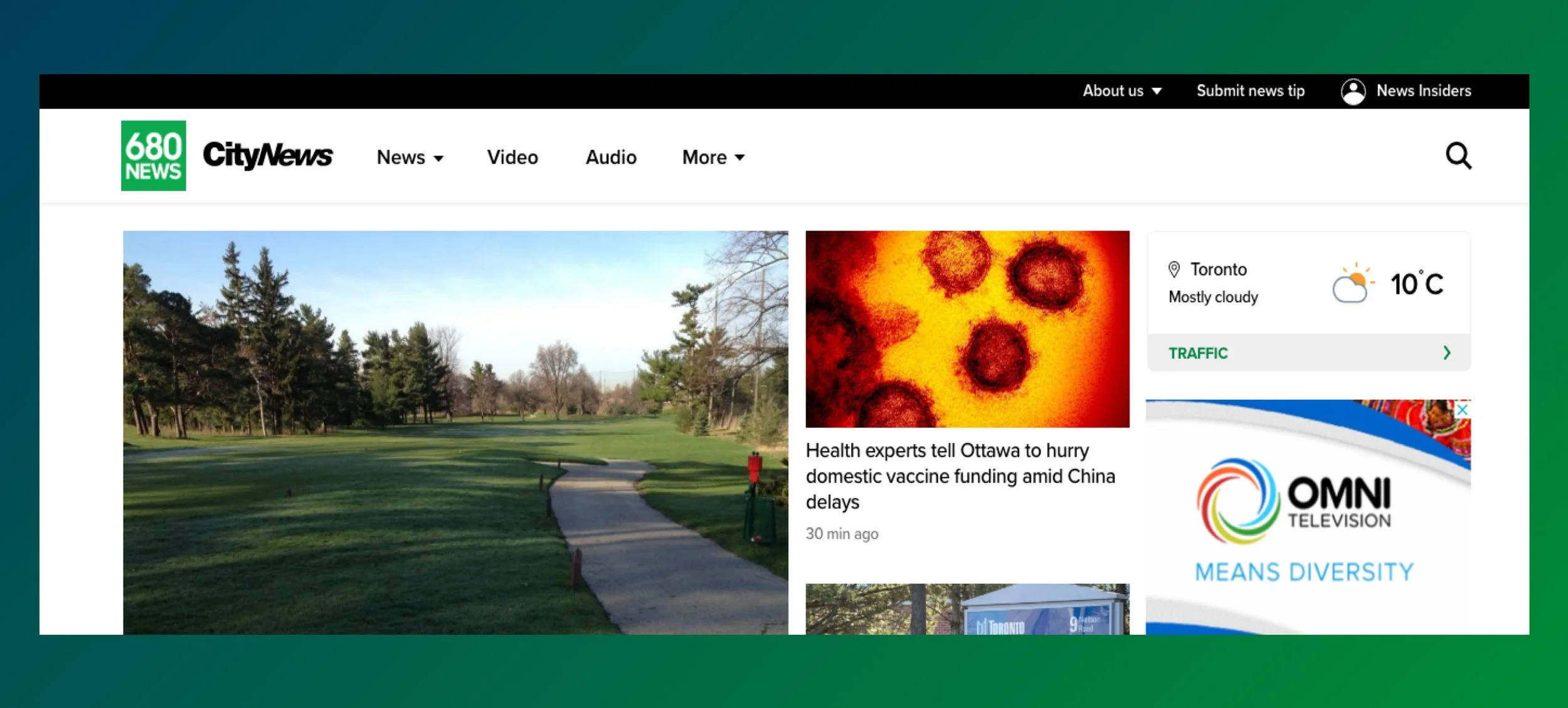
redesigned desktop hero module
Hero module
On desktop, I showed the hierarchy and importance of stories through sizing.
It enables users to easily identify the main headlines and then quickly scan through the stories.
Finally, it was essential to display the weather and traffic module as early as possible as both elements were strong identity of the radio brand but also key information users were looking for.
The rest of the homepage consisted of reusable modules that editors could place as they want based on the different themes they wanted to create.

redesigned homepage
The article page
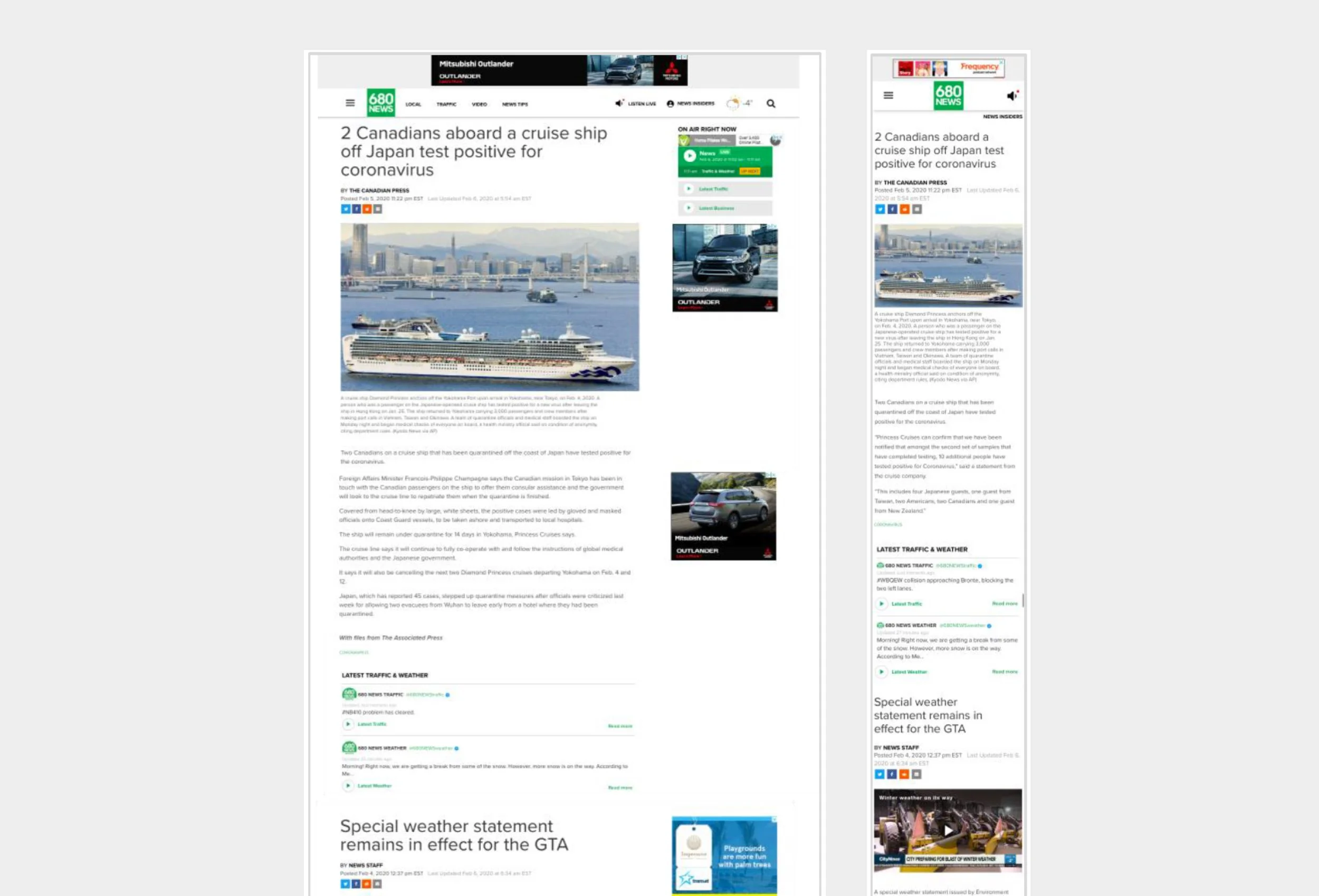
existing article page
Improvement opportunity
The article page presented five articles back to back accessible through a very long scroll. The only way for users to choose the next article was to select it from the homepage or the nav.
The opportunity here was to create a smooth reading experience by helping users to go from stories to stories without disruption.
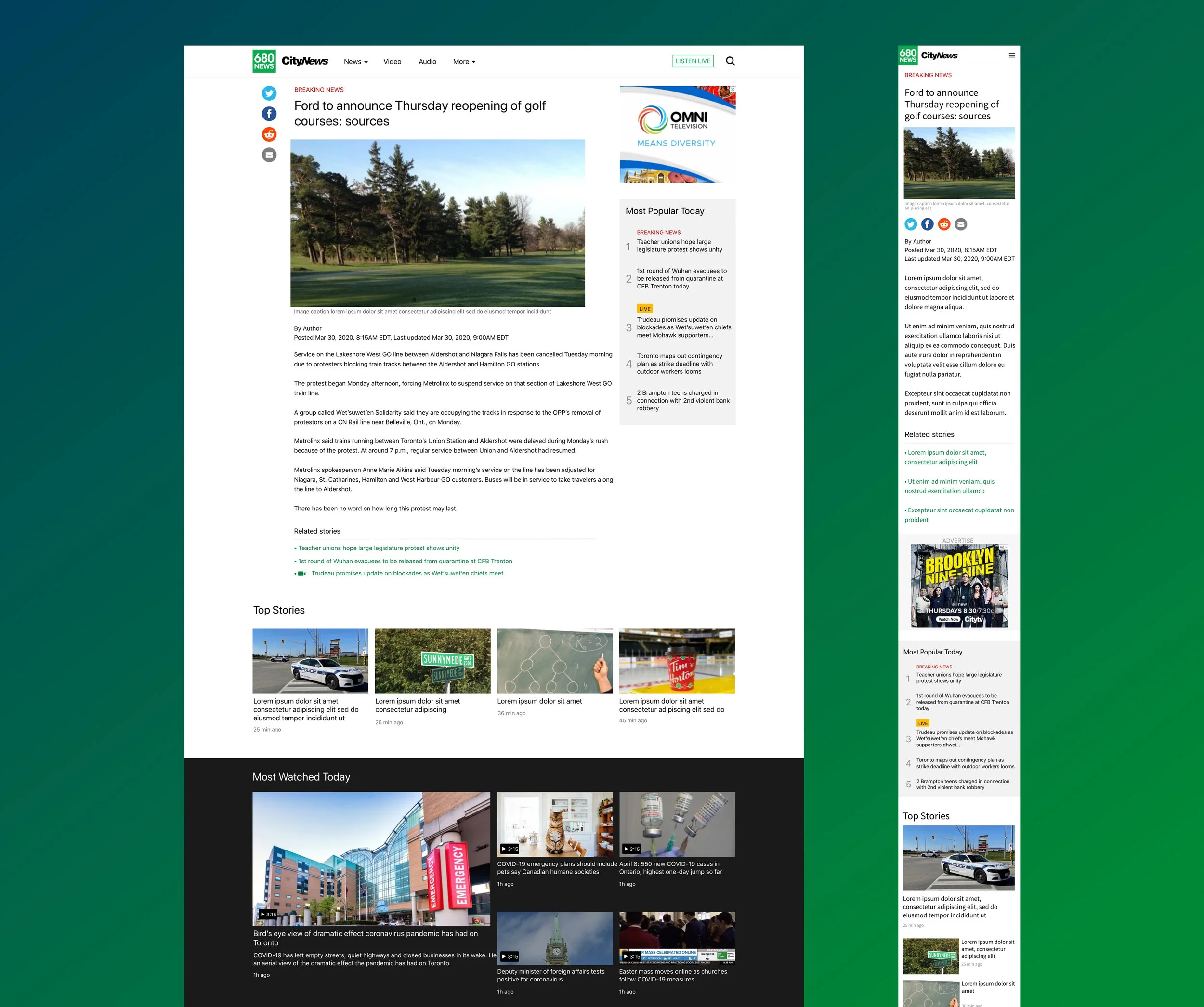
redesigned article page
Intentional reading experience
I decided to make users decision makers of their reading experience.
By removing the long scroll, users could focus on the article they were interested in, then choose what to read next by selecting it from the recirculation modules.
The recirculation modules were reusable modules that could be used throughout the website for design consistency.
The video page

existing video page
Improvement opportunity
The video page wasn’t mobile friendly. Users needed to scan through all the Live video placeholders before reaching videos they could play.
Moreover, the media component being full width, browsing users could spend a very long time scrolling before finding something of interest.
The new page needed to enable users to quickly scan through content to find something they want to watch.
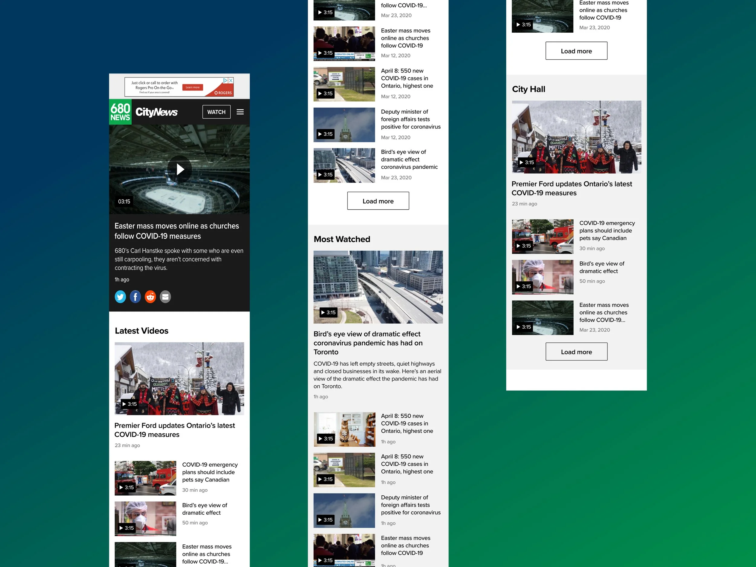
redesigned video page
Quick access to videos
I leveraged the module pattern introduced on the homepage as it allowed to neatly separate playlists.
Users can easily identify a new playlist and go through it.
Top nav
A redesign wasn’t complete without a review of the websites information architecture and making sure users could easily find what they need through the top nav.
existing desktop nav
Improvement opportunity
The top nav was made of a primary nav and a secondary nav.
The primary nav displayed links to both pages that brands wanted to promote and pages that users were most interested in. Whereas the secondary nav was hidden inside the hamburger menu and was a list of pages.
Thus, the opportunity was to help users find what they want in an organized manner.
redesigned desktop nav
Focus on content
I liked the idea of separating information through the nav, so I kept the idea of a primary and secondary navigation.
On desktop, I chose to display links to content on the primary nav while the secondary nav directed to brand information.

redesigned mobile nav
Effective navigation
Following that primary and secondary nav idea, on mobile within the hamburger menu, I created visual separation through font weight and size.
Besides being at the top, links to content were heavier and bigger while links to brand information were thinner and smaller and lower on the screen.
Results
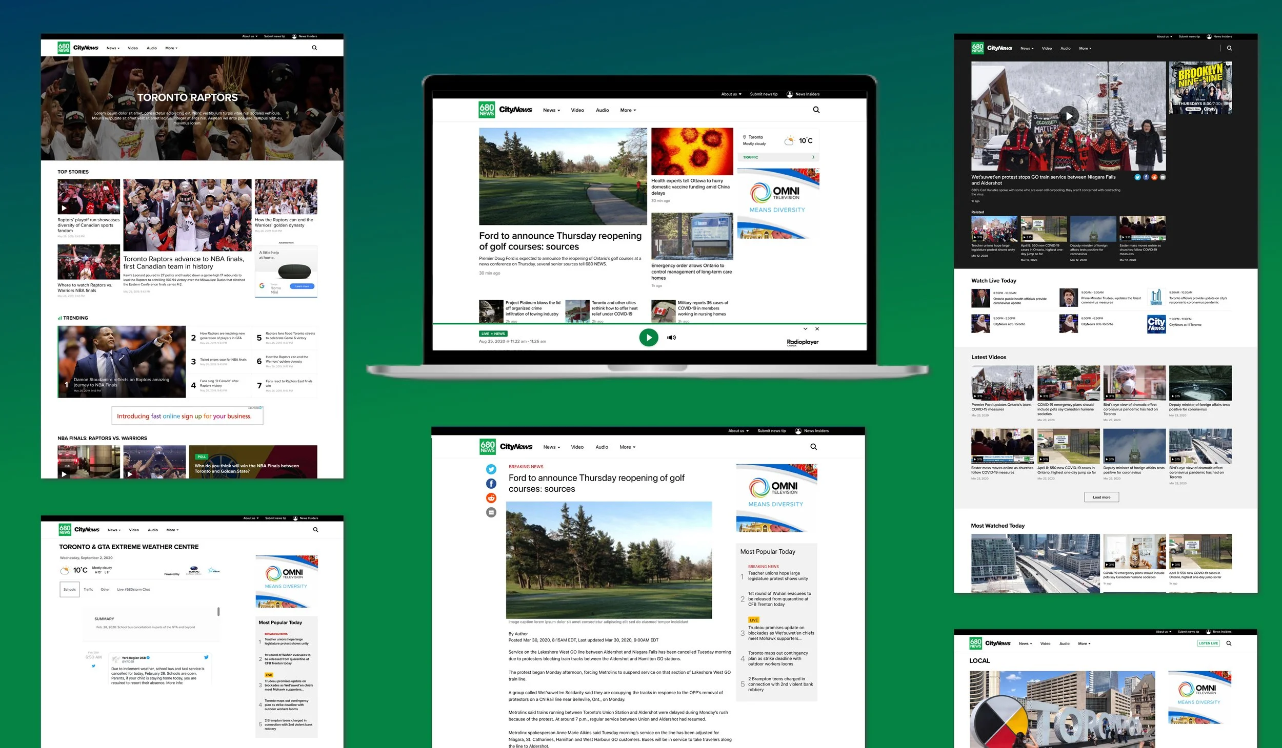
I handed off the project once all the pages have been redesigned right before user testing. The test has been a success as the designs I created have been implemented live after a few months.
The only difference between my mocks and the live website is the branding as it wasn’t finalized while I was working on the project.